Colour Theory
First of all: Happy New Year peeps!:) Hope you had a wonderful festive season and you managed to spend some quality time with your loved ones. After nearly a month off, it is really hard to get back to reality. But luckily we had a really fun and creative first lesson to start the new year with.
Today's lesson was about 'Colour Theory' and 'Contrasting Eyeshadows'. We had to create a make-up look using contrasting eyeshadows.
But before we go there let's talk a little bit about Colour Theory.
"In the visual
arts, colour theory is a body of practical guidance to colour mixing and the
visual effects of a specific colour combination. There are also definitions of colours based on the colour wheel: primary colour, secondary colour
and tertiary colour. Although colour theory principles first appeared in the
writings of Leone Battista Alberti (c.1435) and the notebooks of Leonardo da
Vinci (c.1490), a tradition of "colory theory" began in the 18th
century, initially within a partisan controversy around Isaac Newton's theory
of colour (Opticks, 1704) and the nature of primary colours. From there it
developed as an independent artistic tradition with only superficial reference
to colorimetry and vision science."- Wikipedia
Colour Theory in Make-Up Artistry
For a make-up
artist it is essential to have a good understanding of colour theory. It is
very important when colour-matching the foundation for your clients and to create the best colour scheme for them (e.g. best make-up for a certain eye colour).
Colour is
light, and light is composed of many colours—those we see are the colours of
the visual spectrum: red, orange, yellow, green, blue, and violet. Objects
absorb certain wavelengths and reflect others back to the viewer. We perceive
these reflected wavelengths as colour.
A make-up artist should understand the basics of Colour
Theory in order to know how colours work with each other, and how one colour will
influence another by placing it next to, or on top of each other, or even how
the colour will result when you mix them together.
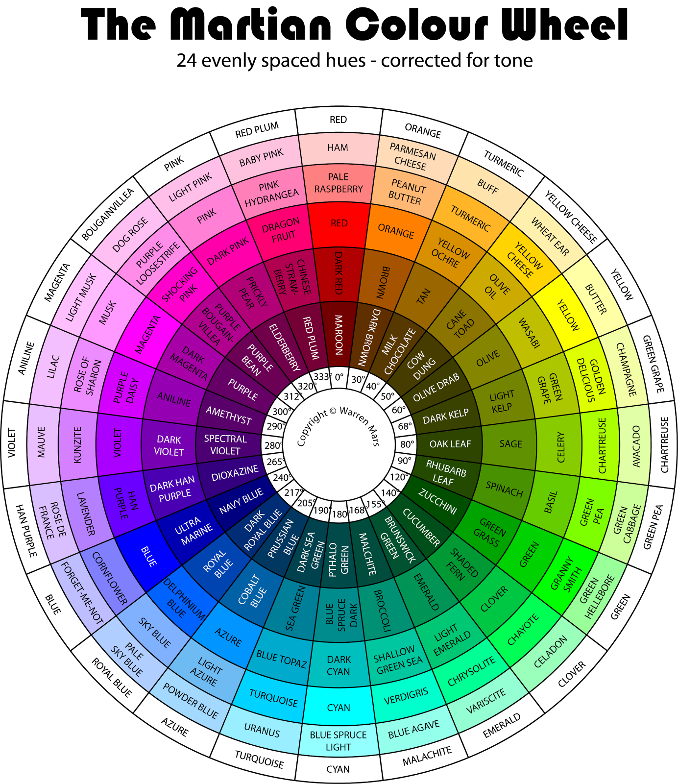
The Colour Wheel:
 |
| 1. |
 |
| 2. |
 |
| 3. |
Warm colours
are bright, passionate and energetic. Warm colours include: red, orange, and
yellow, and variations of those three colours.
In make-up
artistry, reds can be both cool and warm. If the red is blue based (a red with
purple or blue undertone), it is cool. If the red is orange based, it is warm.
Cool colours
give an impression of calm, and create a soothing impression. Cool colours
include: violet, blue, and green.
In make-up
artistry, the same theory applies with the colour green. If a green has more
gold/yellow undertone, then it is warm. If a green contains blue undertone,
then it is cool.
The colour
wheel is divided into three categories: Primary, Secondary and Tertiary.
Primary: the
three primary colours are: red, yellow and blue. These colours are considered
to be foundation colours because they are used to create all other colours.
Secondary: by combining two of the primary colours, three secondary colours
are formed. For example, when you mix red with yellow, you will get an orange
color. The Secondary colors are: orange, green and violet.
Tertiary: the
six tertiary colours are made by combining a primary and an adjacent secondary
colour. These colours are: yellow – orange, orange – red, red – violet, violet
– blue, blue – green, and green – yellow.
Complimentary and analogous colours:
 |
| 4. |
Complementary
colours: Combining colours from opposite sides of the colour wheel. They bring
out each other and both colours appear stronger against each other.
Analogous (or
Adjacent) colours: using three (or more) colours that are next to each other on
the colour wheel.
When you mix complementary
colours together, they produce a neutral gray colour. This means that you are
best to use other colours to cancel out the blemishes.
This theory is
also used for colour correcting on the face and for under eye concealing. If
someone has a purple under-eye, use a concealer with yellow undertone.
The same theory
works for people who have dark blue around their eyes. It is best to use an orange
colour corrector first (to neutralize the dark blue tone), than use a concealer
on top to match the person’s natural skin-tone.
 |
| 5. |
Holly's demo:
After a quick introduction to Colour Theory, Holly demonstrated a quick cut crease eye make-up look, using contrasting colours.
She used a purple pencil to make a sharp line in the crease which then she blended out towards the brow-bone, using a purple eyeshadow by MAC.
 |
| Photo by me |
She then used a white eye pencil as a base for the eyelid.
 |
| Photo by me |
After applying the white base Holly used a really bright yellow pigment, as this is the complementary colour of purple and she pressed it into the white base using a flat eyeshadow brush. She did not blend these two colours together as she wanted to create a sharp contrast between the two colours.
 |
| Photo by me |
 |
| Photo by me |
Holly asked us to create any kind of creative make-up look, using contrasting colours. She also wanted us to do a full face, rather than eyes only.
Practical:
I started the make-up application by covering my model with a cape as usual. After washing and sanitising my hands I prepped her skin, using a cleanser, toner and a moisturiser. I decided to start with the eyelids so I can clean any fallouts without ruining the foundation. I decided to go for a blue-orange combination.
I applied a white base to start with, because it can really intensify and make any colour pop when applied on top of the white. I used NYX's Jumbo Eye Pencil in Milk. I blended this into the skin with my fingers.
 |
| Photo by me |
I than applied MAC's Electric Eel eyeshadow into the crease and blended it out. I used a skin toned eyeshadow by Sonia Kashuk to soften the edges towards the eyebrows. I than applied MAC's Rule to the middle part of the eyelid and a touch of Chrome Yellow by MAC to the inner corners. I also added a little bit of Carbon by MAC to the outer corners to darken it slightly. For blending I used a MAC 217 brush and a Sigma E25 brush.
 |
| Photo by me |
Once I finished the upper upper lids I moved on to the skin. The reason for that was because I wanted to finish the eye make-up by blending the colours to the temples and the top of the cheekbones, so I had to do the skin first and than I go back to the eyes to finish the lower lids.
I first applied a peachy colour corrector underneath my model's eyes to counteract the blueness underneath her eyes. I used NYX Pro Concealer in Peach. I than mixed three shades of MAC Face and Body together to get the right foundation shade(C3, C4 and a touch of N7). I applied this mixture with a flat foundation brush and blended it in with a Real Techniques Expert Face brush. Once I was happy with the coverage I applied a thin layer of Ben Nye Translucent powder to set it.
I moved back to the eyes. As I wanted to create a quite messy, asymmetrical editorial look, I decided to apply some orange eyeshadow by Makeup Revolution (Get Ready Mono eyeshadow) on the sides of the face, the temples and the top of the cheekbones.
 |
| Photo by me |
 |
| Photo by me |
I than applied MAC BlackTrack to the upper lash lines and lined the upper and lower waterlines to give the eyes some definition. I also applied two coats of MAC Haute & Naughty Too Black Lash Mascara.
 |
| Photo by me |
I really felt something was missing so I decided to apply black spots around the eyes to give the look an extra finishing touch. I used MAC's Black Track eyeliner for this.


As this was a creative editorial look, I decided to apply the same bright orange eyeshadow to the centre of the lips and leave it quite messy looking.
And here is the final look:
 |
| Photo by me |
 |
| Photo by me |
 |
| Photo by me |
Overall I was quite happy with the result. I really enjoy doing creative looks because using my imagination challenges me the most. I like creating unusual looks and to use different products and textures for the same look.
I probably could have spent a little bit more time perfecting the skin, especially underneath the eyes. Looking back at the photos I would probably bring the orange colour further down. I would also use a different, brighter shade of blue eyeshadow to create an even sharper contrast between the colours.
Product List:
• Kaeso Beauty Cleansing Milk
• Kaeso Beauty Toner
• Superdrug Vitamin E serum
• Kaeso Beauty Moisturiser
• NYX Jumbo Eye Pencil in Milk
• MAC Electric Eel eyeshadow
• MAC Rule eyeshadow
• MAC Electric Yellow eyeshadow
• Makeup Revolution Get Ready Mono eyeshadow
• NYX Pro Concealer in peach
• MAC Face and Body foundation in C3 and C4 and N7 shades
• Ben Nye Translucent Powder
• MAC Black Track eyeliner
• MAC Smolder Kohl Pencil
• MAC Haute & Naughty Too Black Lash Mascara
• Flat foundation brush
• Real Techniques Expert Face Brush
• MAC 217 brush
• Sigma E25 brush
• Powder puff
Reference:
Tommy (No Date) Colour Theory & Make-Up Artistry [Online] Available at: https://tommybeautypro.wordpress.com/2013/01/05/makeup-101-colour-theory-make-up-artistry/
(Accessed: 11 January 2016)
Picture reference:
1. Veffer, L.(2012) The best eye shadow for your eye colour [Online] Available at: http://makeupbyliaveffer.blogspot.co.uk/2012/05/best-eye-shadow-for-your-eye-color.html
(Accessed: 11 January 2016)
2. Mars, W. (No Date) Martian Colour Wheel [Online] Available at: http://warrenmars.com/visual_art/theory/colour_wheel/colour_wheel.htm
(Accessed: 11 January 2016)
3. Tommy (No Date) Colour Theory & Make-Up Artistry [Online] Available at: https://tommybeautypro.wordpress.com/2013/01/05/makeup-101-colour-theory-make-up-artistry/
(Accessed: 11 January 2016)
4. Tommy (No Date) Colour Theory & Make-Up Artistry [Online] Available at: https://tommybeautypro.wordpress.com/2013/01/05/makeup-101-colour-theory-make-up-artistry/
(Accessed: 11 January 2016)
5. Tommy (No Date) Colour Theory & Make-Up Artistry [Online] Available at: https://tommybeautypro.wordpress.com/2013/01/05/makeup-101-colour-theory-make-up-artistry/
(Accessed: 11 January 2016)
No comments:
Post a Comment